Comparing the Price Comparison sites
Author: Rob Stevens
Published: 21st August 2023
Finding ways to tighten our belts and save money has become a national obsession. Those companies that promise to help in this quest have a tremendous opportunity to promote their services and secure market share.
The comparison sites offer a wide range of money saving services and increasingly a first stop for consumers looking for the best deals.
In this highly competitive sector, we wanted to know who was running the most effective campaign. We took a look at the Q1 TV campaigns of several of the top brands to see how they performed. In this case we chose sessions on the brand’s app and website as the response metric to the TV campaign.
What were the results?
One interesting thing we noticed in our data is that all the brands had a strong carry over from their campaigns. e.g. the campaigns continued to drive responses for several weeks after the campaign ended. This makes good sense in a sector with strong brands as well as being a very relevant service for many people in our current economic climate. This is an important thing to factor in when trying to calculate the ROI from the campaign
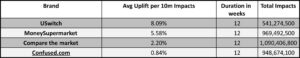
See below for the results.
- USwitch had the most effective campaign with an average uplift of 8.09% per 10M impacts over a 12-week campaign in spite of investing in 30% less impacts. However, USwitch is the smallest of the brands listed so has a lower baseline from which to lift. It will become increasingly harder to maintain this as they grow.
- Money supermarket delivered an impressive 5.58% uplift/ 10M impacts for one of the largest and highest media spenders in the category.
- Compare the market came next with 2.20% uplift/10M impacts. As one of the biggest competitors it’s hardest for them to get a big uplift as their baseline is higher. However, they generated the most responses from any of the listed campaigns at 3.65M website visits vs 1.78M from USwitch. They would need to look at their uplift over time to assess the relative success of this campaign.
- Confused.com is the outlier with the lowest uplift with 0.84% uplift/10M impacts. Their media spend is comparable to the other heavyweights as is their brand awareness. Other factors in our data may bring insights to the reason for this performance such as media allocation, creative performance or share of voice.
Methodology – How did we do it?
We used a natural test and control methodology based on our Single-Source data. Single-Source data is the measurement of TV and other media exposure, purchase behaviour and location data over time on the same individual. ViewersLogic gathers its passively collected Single-Source data from the first of its kind consumer panel in the UK.
Control Group: Individuals who were not exposed to TV activity from the brand in question during the campaign period or in the 2 weeks prior.
Test Group: Individuals who were exposed to TV activity from the brand in question during the campaign period but not in the two weeks prior.
A response is a session on the app and visits to the website for the brand in question, de-duplicated so that we can only have a maximum of one response per user per week. The response rate is the number of responses as a percentage of the entire group.
We compared the response rate of each group before and during the campaign and calculated the uplift of the test group that was over and above the control group. For example: for every 10M impacts the chance of the test group to visit the Compare the market website or app grew by 2.20 % over the control group.
Monitoring period: 26/12/22 – 27/03/23